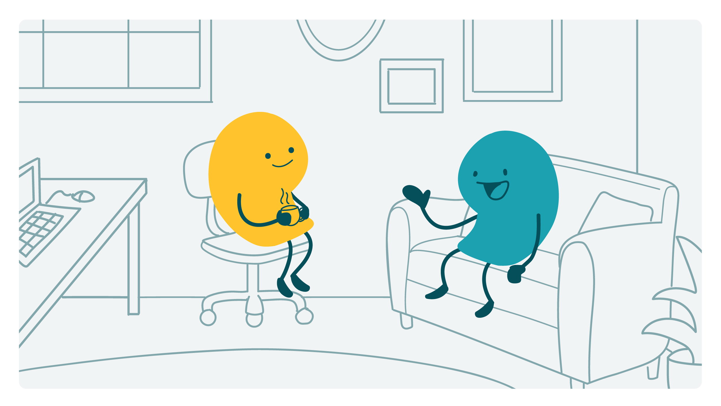
Here at We ❤️ Health Literacy HQ, we’re excited to see many research institutions and pharmaceutical companies working to increase diversity, equity, and inclusion in clinical trials. These efforts often focus on enrolling participants from underrepresented groups — like people of color, women, and LGBTQ+ people.
But did you notice anyone missing from that list, dear readers? Although 1 in 4 people in this country have a disability, people with disabilities are often left out of clinical trials and the conversation about diversity in clinical trials. That means researchers miss out on data about how treatments affect people with disabilities, creating gaps in medical knowledge. Here’s a great example from the STAT piece linked above: Although many people with Down syndrome develop Alzheimer’s disease or dementia later in life, few clinical trials for Alzheimer’s treatments include people with Down syndrome.
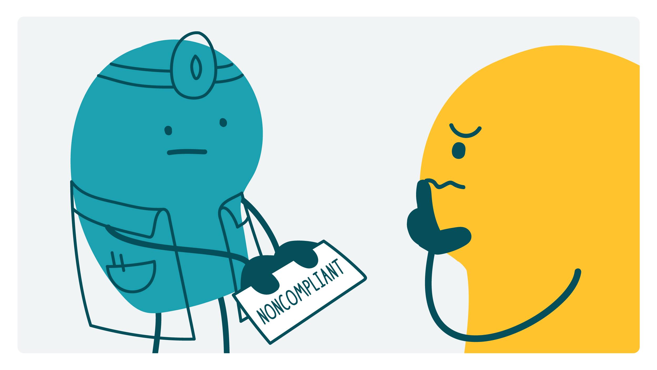
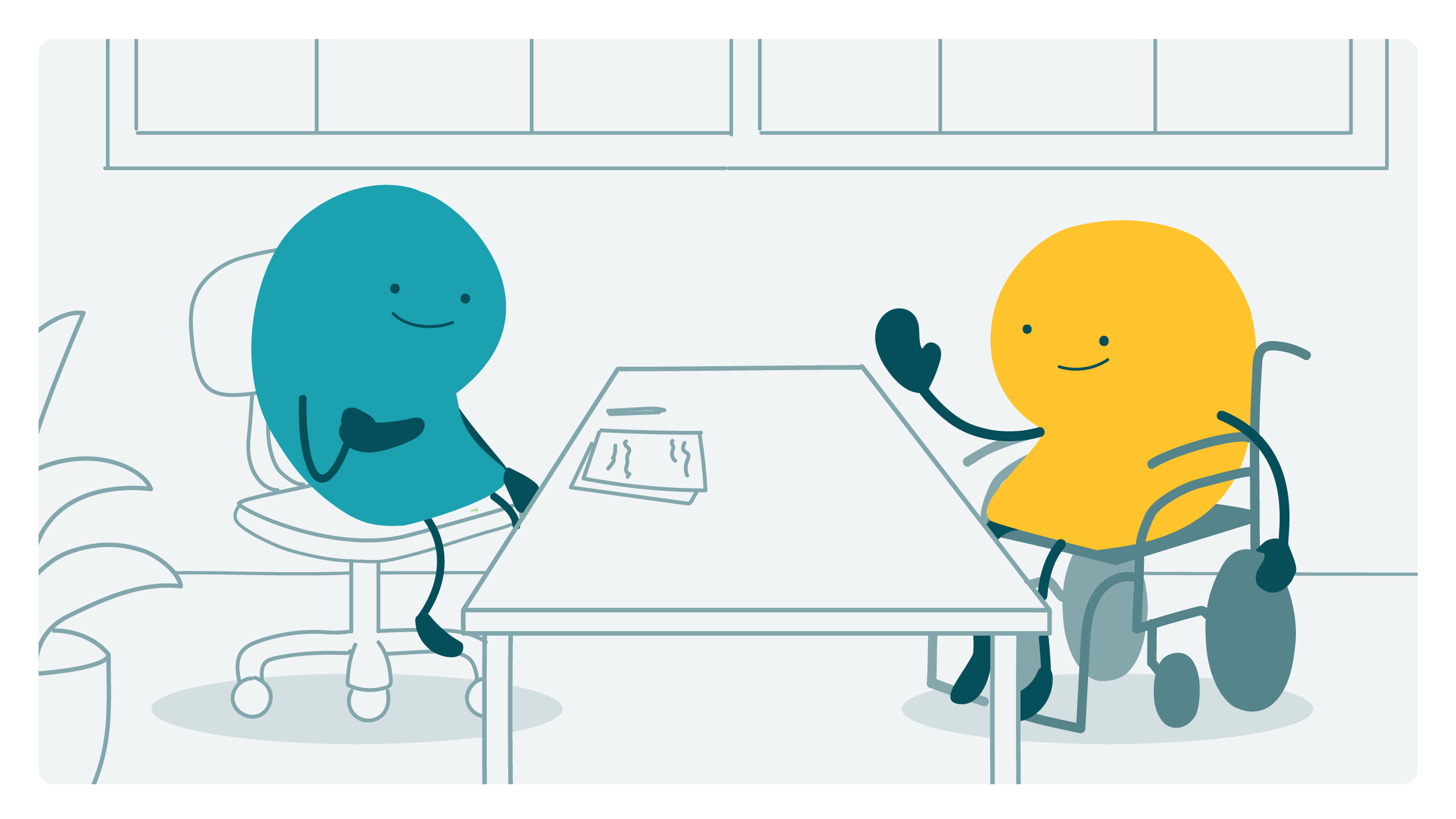
So why don’t more people with disabilities participate in clinical trials? Eligibility criteria are a big factor. Some trials have criteria that specifically exclude people with certain disabilities. And some trials exclude wide swaths of people, like anyone who has cognitive challenges, can’t drive to study appointments, or seems unlikely to successfully complete the study. Subjective criteria leave room for implicit bias to sneak into the selection process — if a researcher has negative beliefs about disability (even subconsciously!), they may be more likely to exclude people with disabilities based on vague criteria.
Most clinical trials don’t seek out people with disabilities or offer the accommodations they need to participate. Accommodations like having an ASL interpreter on site, making consent forms easier to read, or allowing participants to bring a support person to appointments would enable more people with disabilities to join clinical trials. On top of these barriers, many trials don’t include disability in their participant stats. So even when people with disabilities do participate, researchers are missing opportunities to analyze the data through the lens of disability.
The work of making clinical research more inclusive is complex, and it’s important to acknowledge some nuances here. Of course, there are situations where disabilities can prevent people from completing clinical trial activities. Plus, researchers aim to eliminate confounding variables — outside factors that may affect study results. In practice, this often leads researchers to exclude people with “complex” medical histories.
So where do we go from here? Researchers can structure eligibility criteria to include as many people as possible, proactively seek out participants with disabilities, and provide necessary accommodations. Of course, these changes won’t happen overnight. In the meantime, health communicators can do what we do best: make clinical trial materials easier to read and understand. And we can amplify the work of people with disabilities who are advocating for a more equitable world.
The bottom line: People with disabilities are often left out of clinical trials and the conversation about diversity in clinical trials. Making clinical research more inclusive is a complex task, but it’s a critical step toward health equity.